Designing the Hashnode Logo with HTML and CSS
How to create Hashnode Logo using HTML and CSS

In this article, we will see how to recreate the Hashnode Logo using plain HTML/CSS. No JavaScript is involved.
Prerequisites
Basic Knowledge of HTML/CSS
A Code editor like VS Code
A web browser like Chrome/Firefox/Edge
Analysing the Logo
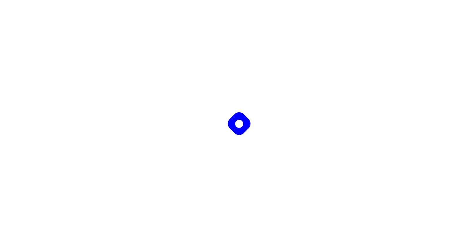
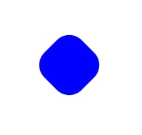
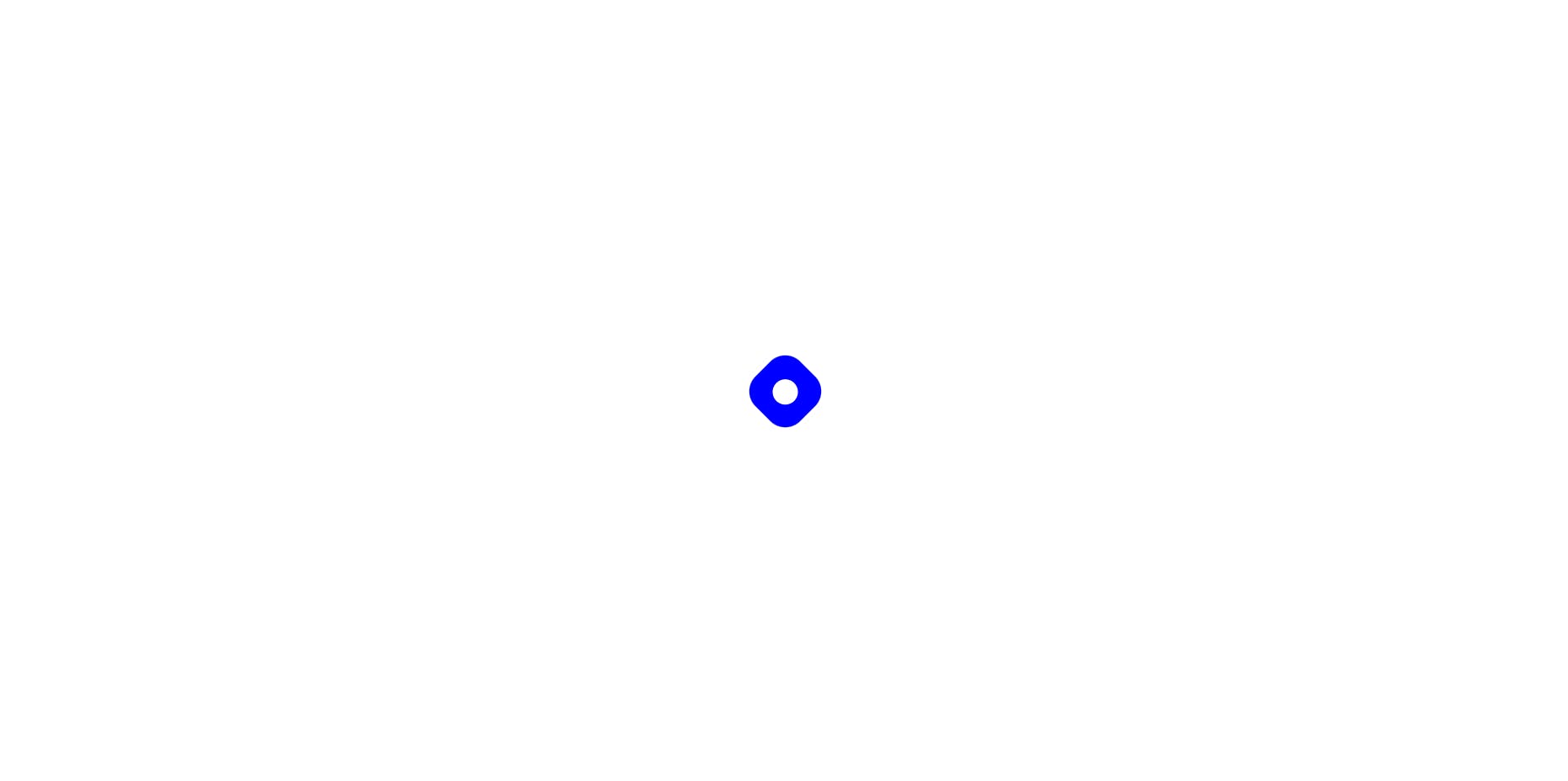
The Hashnode Logo comes in light and dark themes and it looks like a tilted square with curved edges and a circle in the centre.
HTML Code
For this project, let's create two files. index.html and style.css.
Open VS Code and create the html boilerplate by pressing ! and enter. Then link the style.css in the head tag. In the body section, let's create two divs, one inside the other as below
<div class="blue-square">
  <div class="circle"></div>
</div>
The outer div has a class blue-square where we will style the outer blue region of the logo and the inner div has a class circle where we will style the inner circle of the logo.
The entire index.html would look like this,
<!DOCTYPE html>
<html lang="en">
  <head>
    <meta charset="UTF-8" />
    <meta http-equiv="X-UA-Compatible" content="IE=edge" />
    <meta name="viewport" content="width=device-width, initial-scale=1.0" />
    <link rel="stylesheet" href="style.css" />
    <title>HashNode Logo</title>
  </head>

  <body>
    <div class="blue-square">
      <div class="circle"></div>
    </div>
  </body>
</html>
Styling with CSS:
In this section, we will style the logo using CSS. Let's make the box-sizing as border-box. Let's remove all the unnecessary margins and paddings that come up with the browser. And finally, let's create a css variable --bgcolor to specify the background as black or white for the respective theme.
* {
  box-sizing: border-box;
  margin: 0;
  padding: 0;
  --bgcolor: white;
}
Next, Let's make our Logo centred on the page. Since our blue-square is a direct child of the body element. We can use the body selector and make the div's inside it centred using the flex property.
body {
  background-color: var(--bgcolor);
  display: flex;
  height: 100vh;
  justify-content: center;
  align-items: center;
}
Here, we have given the background-color property to be the variable --bgcolor. We have made the display as flex to make it a flexbox. Height is set to 100vh to take up the entire height of the viewport. justify-content: center will make the div to be centered horizontally and align-items: center will make the div to be centred vertically.
Note:
align-items: centerwon't work if you don't specify a height property to your element.
There won't be anything to be seen on the screen still.
Let's move to style the outer part of our logo which is the blue colored region. Use the .blue-square selector to style the element.
.blue-square {
  width: 60px;
  height: 60px;
  background-color: blue;
  border-radius: 20px;
  rotate: 45deg;
}
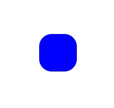
Let's give the outer div a height and width of 60px and the background-color of blue. And let's give a border-radius of 20px to look more curved. At this point, it would look like a blue square with curved borders as shown below
But the actual logo is not just a square, but a tilted one. So, let's rotate it by 45deg. Add this property to the above selector.
.blue-square {
  /* Other Properties */
  rotate: 45deg;
}
Now, it will give us the resemblance of the actual logo.
Now, let's move on to design the center circle. But wait, to make the circle centred, we need to make its parent a flexbox and give the justify-content and align-items property to center. So, here the parent of the circle is the blue-square. Let's add those properties to that.
.blue-square {
  /* Other Properties */
  display: flex;
  justify-content: center;
  align-items: center;
}
Now, let's style the circle element. Let's give it a background color the same as the --bgcolor variable. Let's give it a width and height of 24px. To make the div a circle, let's give it a border-radius of 50%. It will make the div to be a circle. As simple as that.
.circle {
  background-color: var(--bgcolor);
  width: 24px;
  height: 24px;
  border-radius: 50%;
}
That's it. The Hashnode logo is complete. Try changing the --bgcolor variable between black and white to see the logo in light and dark modes.
In Dark Mode:

In Light Mode:
Disclaimer: This may or may not have the exact aspect ratio or dimensions and other characteristics of the original logo. For legal use of the Hashnode Logo, contact the Hashnode team directly.
Conclusion
If you found it helpful, please leave a like and let me know your thoughts in the comments below. Follow this space for more such logos in the upcoming days. You can see the logo in action in the below codepen.